Often digitized, never revived
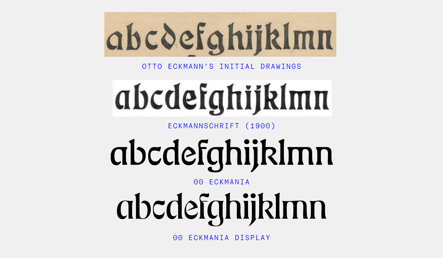
00 Eckmania is a digital interpretation of "Eckmannschrift", a 1900 typeface designed by Otto Eckmann (punches cut by Louis Hoell) and published at the Rudhardsche foundry (under the supervision of Karl Klingspor).
Born in Germany in 1865, Otto Eckmann was a multifaceted artist known for his contributions to the Jugendstil (the German equivalent of Art Nouveau). The creation of Eckmannschrift, his only published typeface, exemplified his mastery of organic forms and decorative elements.
Many digital typefaces are based on Eckmannschrift, but almost all of them feel like pure digitizations, keeping all the original's quirks, irregularities, and historical clues. The only notable exception would be James Edmonson's Eckmannpsych, yet this actually takes it one step further, creating something beautiful but very distant from the original source. To my mind, there was still a missing revival, faithful to the original yet redesigned and adapted to contemporary aesthetics and uses. Until now! :-)

Adaptations
One of the main challenges in adapting Eckmannschrift was to make it into a consistent type family. Although it is clear that Otto Eckmann had a unique vision for floral shapes and ornaments, it is also clear that he was not a type designer by training! Some of the shapes lack control, and it feels like each shape was designed on its own, not as a coherent system. So one of my main tasks was to make choices and in many cases differ from historical sources to make it more suited to contemporary tastes and uses.

An unconventional contrast
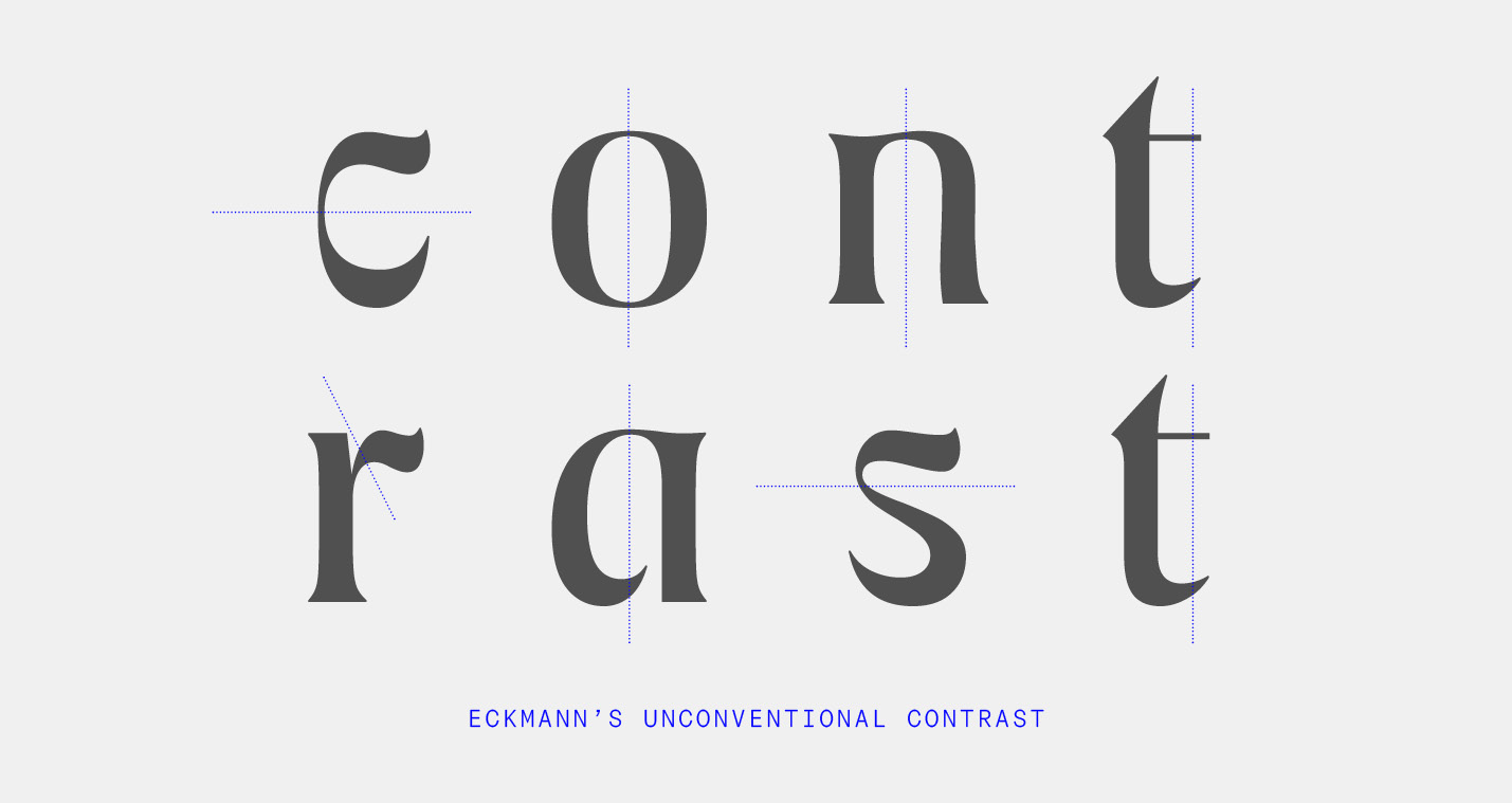
What first drew me to Otto Eckmann's typeface is its unconventional contrast. In most letters, the contrast follows a "normal", vertical axis. But in a few odd cases, mostly in round letters, the contrast axis suddenly switches to an almost "reverse," horizontal axis. Surprisingly, this works very well and even brings a unique texture to texts. As my former colleague Toshi Omagari used to say, "consistency is overrated". And even though consistency is type design's number one rule of thumb, it is surprising how much you can get away with planned inconsistencies.

With optical size axis
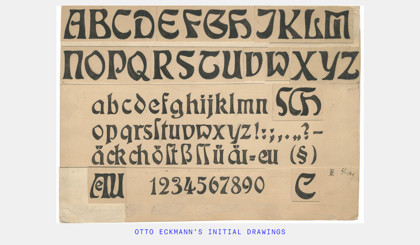
Eckmannschrift started as lettering for a magazine masthead, and later on was turned into type. There are also initial drawings from Otto Eckmann which differ greatly from the final type (where the punchcutter Louis Hoell made many informed adaptations). As a result, there are multiple historical sources to draw inspiration from. Some are high in contrast and very flourished while others are more serious and feature a moderate contrast. Instead of focusing on a single source, 00 Eckmania encapsulates a whole variety of tones of voices through its optical size axis. The small size extreme can actually hold surprisingly well at text sizes and withstand relatively long pieces of text; while the display cuts show their full potential of expressiveness and flourishes. The terminals seemingly morph from serif-like shapes to pen brush strokes creating a wide array of styles.
Two more axes to go?
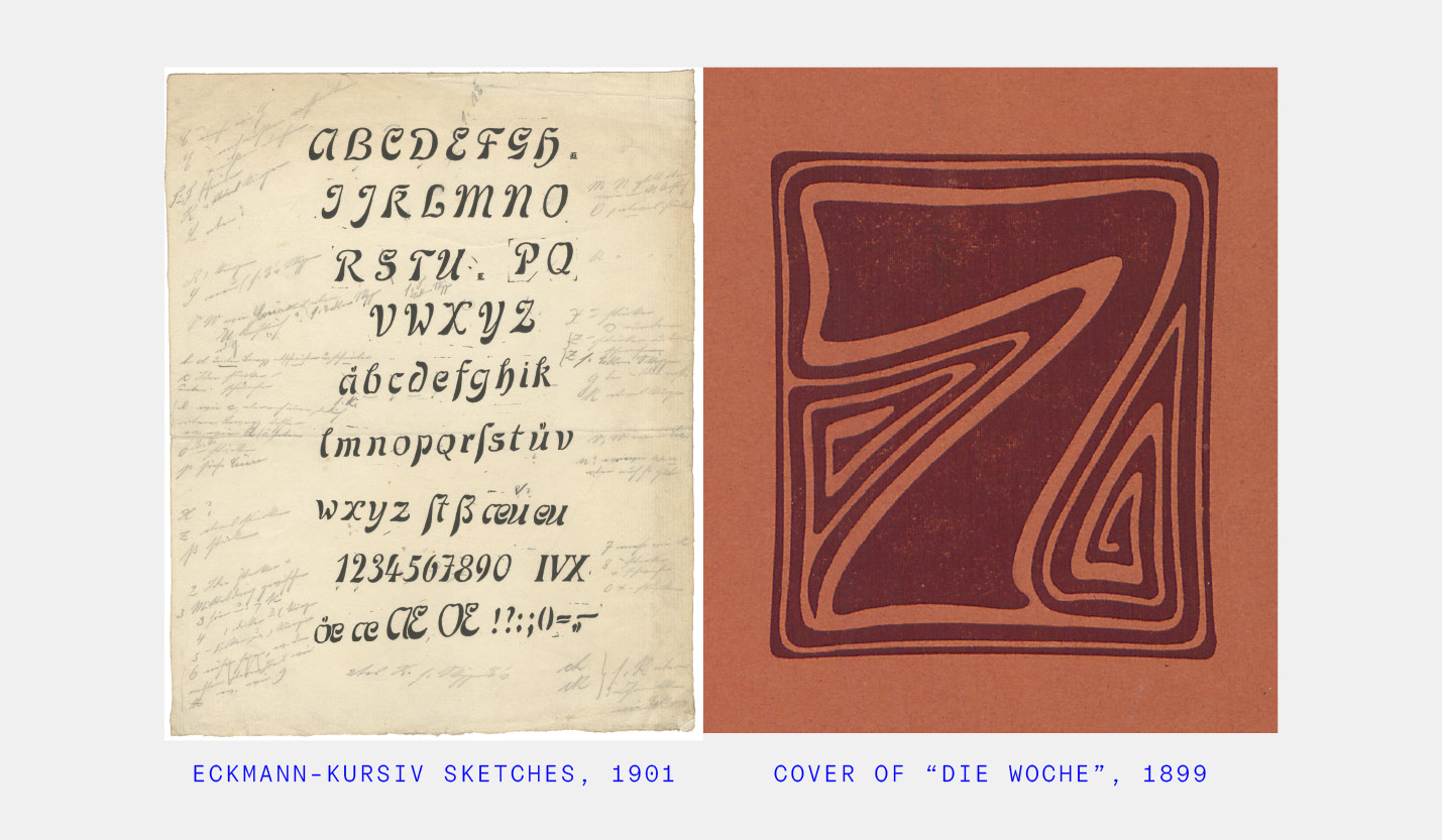
The D0UBLE ZER0 does state it plainly: "All Fonts Shall Follow 4 Axes: Monospace, Optical Size, Weight, Italic". But 00 Eckmania only features two axes: Weight & Optical Size. Yes, the first release after the launch already breaks the manifesto — Shame on me. But think of it that way: it's an ongoing process — two axes done, two more to go! And there are very interesting historical sources to draw from. There are actually unpublished drawings from Otto Eckmann for "Eckmann-Kursiv", an italic companion to Eckmannschrift. Although still at early stages, there are plenty of interesting details to draw from. Then there is also the "Eckmann Initialen", a series of ornamented initials which accompanied the release of Eckmannschrift and which could be very interesting candidates for the monospace axis? So stay tuned!

